The 60-30-10 Paint Rule is Dead: How to Balance Modern Complex Colors
If you have ever read a beginner's interior design blog, you have undoubtedly encountered the 60-30-10 color rule. The concept insists that a room should be 60 percent dominant color, 30 percent secondary color, and 10 percent accent color. In the 1990s, when people painted their walls solid beige, bought matching solid blue sofas, and threw two solid red pillows in the corner, the rule worked. Today, the paint industry formulates complex, muddy colors that shift drastically depending on the light. If you apply the rigid 60-30-10 rule to modern, highly textured interiors, your room will look flat, forced, and completely devoid of personality.
My Hands-On Experience with Failed Color Formulas
In 2024, a client hired me to fix their newly built mid-century living room. They had followed the 60-30-10 rule exactly as a magazine told them to. They painted 60 percent of the room a flat, stark gray. They bought a giant mustard yellow velvet sofa for their 30 percent, and scattered teal accessories everywhere for the 10 percent. The room felt like a hospital waiting room with a few loud objects thrown into it. The stark gray fought violently against the warm yellow. I had to rip the formula apart. We repainted the walls a complex, warm greige that had subtle green undertones, layered three different shades of rust and mustard onto the sofa, and removed half the teal. The room instantly felt expensive and grounded. I learned that color is about fluid layering, not rigid mathematics.
The Problem with the 60 Percent Base
The biggest flaw in the traditional rule is how people interpret the 60 percent. Most homeowners assume the 60 percent must be the wall paint. They pick a single, solid color and slather it across four walls. This creates a giant, overwhelming box of color.
According to the Color Marketing Group, the dominant base of a room is actually comprised of the walls, the flooring, and the ceiling combined. If you have beautiful, warm hardwood flooring that takes up a massive visual footprint, that wood tone is actually your dominant color. You cannot ignore the floor and paint the walls a cool, stark gray without causing a violent visual clash.
Embracing Tonal Layering Instead
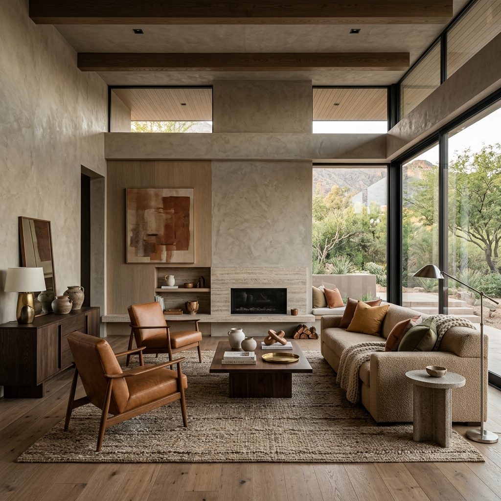
Instead of picking three distinct colors on the color wheel, modern architectural design relies on tonal layering. You select a single, complex neutral—like a deep, moody olive or a rich, warm taupe—and you layer variations of that exact same color across the room.
If you paint the walls a mid-tone olive, you buy a rug that features a slightly darker forest green. You hang curtains that are a pale sage. By varying the depth of a single hue, the room feels cohesive and deeply intentional. You create a rich, immersive environment rather than a paint-by-numbers grid.
How to Actually Test Paint Colors
The rigid 60-30-10 rule also ignores the physics of light. You cannot pick your colors at the hardware store under fluorescent lights. You must test the paint inside your actual house.
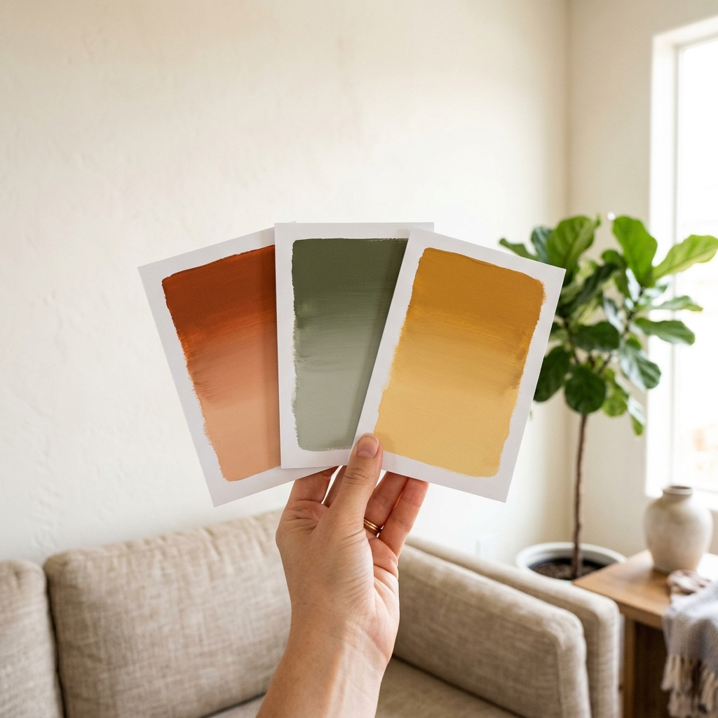
Never paint tiny test squares directly onto your existing drywall. Your current wall color will heavily distort how your eye perceives the new color. Instead, buy a large piece of bright white foam board. Paint the foam board with two coats of your sample color. Leave a one-inch white border around the edge of the board. That white border isolates the new color from your old wall color, allowing your brain to see the true undertone.
Move that foam board around the room. Look at it at 8:00 AM when the light is cool and blue. Look at it at 4:00 PM when the light is warm and orange. A color that looks perfectly neutral in the morning might look completely purple by the evening. Only after you have tested the color in every lighting condition should you pull out your paint calculator and order your gallons.
Need to calculate measurements for your space?
Use our free, interactive Paint Calculator to calculate dimensions, box requirements, or guidelines automatically.
Calculate Your Paint Needs→